The Checkout Abandonment Trap: Why Your Payment Flow is Killing Your Revenue
Home Blog D2C
By: Kirtika Srivastava Published: Jul 18, 2026
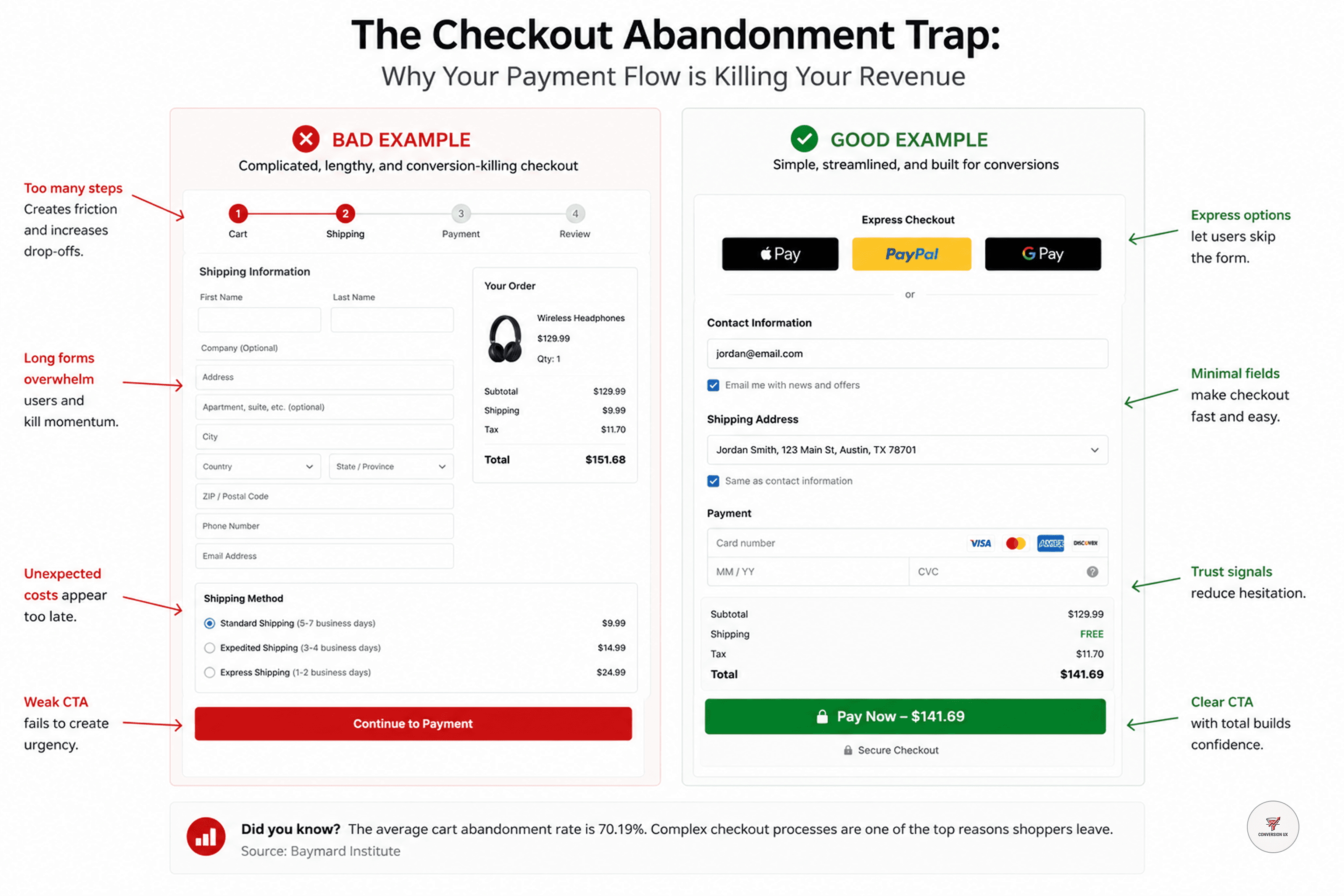
The checkout page is the most critical real estate in your entire D2C business. It is the moment where "intent" turns into "profit." Yet, most founders treat it as a generic form. If your checkout page has even one unnecessary field, one confusing error, or one surprise cost, you are losing money.
1. The "Surprise Cost" Psychological Barrier
Nothing kills a conversion faster than an unexpected shipping fee or tax at the very last step. Humans feel a sense of "loss" when they see the price jump suddenly.
The Fix: Be upfront. Show total costs early in the cart, not just at the final payment screen. Transparency builds trust, and trust eliminates hesitation.
2. The "Form Fatigue" Phenomenon
Why are you asking for a phone number if you don't need it for shipping? Why is there a "Discount Code" box that is so prominent it makes users leave your site to hunt for coupons on Google? Every single field in your checkout form is a "cognitive tax" on the user.
The Fix: Use "Guest Checkout" as the default. Force registration after the purchase, never before. Your goal is to get the payment first, build the relationship second.
3. Designing for Security (The Human Angle)
Even with the best tech, a user won't pay if they don't feel safe. A generic, unbranded checkout page makes people worry about their card data.
The Fix: Keep the branding consistent from the product page all the way to the "Thank You" screen. Use trust badges (secure payment icons) near the "Place Order" button. This isn't just decoration; it's a psychological cue that tells the human brain: "It is safe to proceed."
Conclusion
Your checkout isn't a place to collect data; it’s a place to complete a promise. If you make it difficult, you are breaking that promise. By removing friction and keeping the process short, honest, and secure, you turn a high-anxiety moment into a smooth, rewarding experience. That’s how you optimize for revenue—one click at a time.
Join the CurvWave UX & CRO Insights newsletter
Marketing strategy is moving away from gut feelings toward data-backed engineering. What matters now is how well you can optimize for human behavior in a crowded market.
The growth operators pulling ahead are the ones building systems to identify friction, map user psychology, and automate conversion flows. At the same time, maintaining a high-converting funnel has become a massive challenge because testing variables takes time—and most brands lack the bandwidth to do it effectively.
That’s why I built CurvWave UX & CRO Insights: to help D2C founders and growth teams move from "guessing" to "engineering" their success. Every week, I share 3-4 deep-dives covering UX audits, funnel psychology, and AI-driven workflow experiments that you can implement immediately.
You can join the newsletter here
Kirtika Srivastava
Kirtika is the founder of CurvWave and the voice behind the CurvWave UX & CRO Insights newsletter. She specializes in the intersection of human psychology and AI-driven conversion engineering. With a deep focus on UX audits and CRO, she helps high-growth D2C brands identify invisible friction and transform it into measurable revenue. She is also the author of ‘UX Decoded’ and ‘Design Mastery’.