The Overloaded PDP Trap: Why Cluttered Product Pages Drive Shoppers Away Before the Cart
Home Blog D2C
By: Kirtika Srivastava Published: Sep 04, 2026
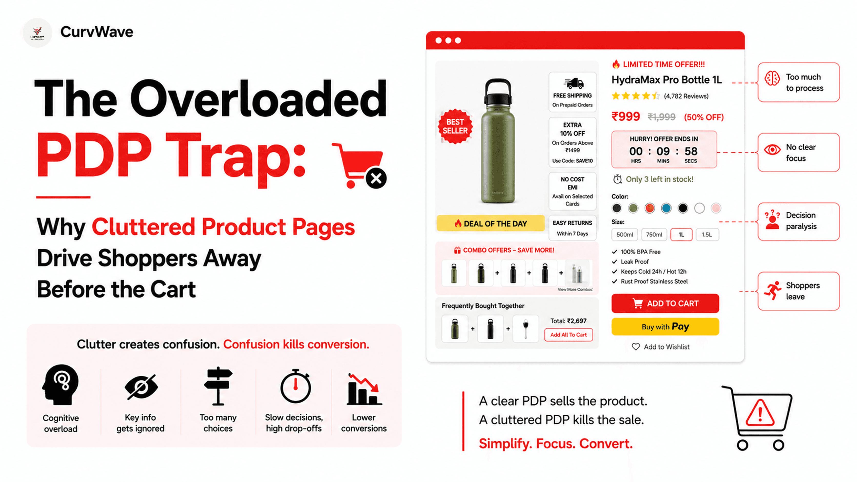
While conducting a diagnostic review on a high-traffic D2C brand recently, the root cause of their dropping conversion rate became immediately obvious. The product detail page (PDP) was so visually heavy, saturated, and saturated with competing colors that a user’s eyes had nowhere to rest.
When digital real estate is treated like a storage unit for every piece of brand information possible, cognitive overload sets in, and users abandon the page before they even consider adding an item to the cart.
1. Visual Noise and Severe Cognitive Overload
When pages are packed with jarring color palettes and heavy graphics competing for attention simultaneously, the human brain gets overwhelmed. If the visual elements do not guide the eye smoothly toward the primary action, visitors experience fatigue and bounce.
The Fix: Introduce strategic whitespace. Clean backgrounds and muted color accents allow the user's eye to focus naturally on product photography, key benefits, and the primary call-to-action.
2. The "Information Vomit" and Hierarchy Breakdown
Many founders make the mistake of dumping clinical reports, comparison tables, ingredient lists, and lengthy text blocks all at once without any priority sequence. If shoppers have to solve a puzzle to figure out what matters first, they leave.
The Fix: Structure your content using a digestible, hierarchical flow. Put the core value proposition and primary benefits upfront, leaving deep technical specs and comparisons for expandable accordions further down the page.
3. Invisible Pricing, Tiny Fonts, and Cluttered Tables
Important conversion details—like clear pricing, sizing metrics, and competitive differentiation tables—are often buried inside low-contrast text or complex, messy graphics. When a customer has to squint or strain to find basic information, trust breaks down instantly.
The Fix: Ensure high-contrast typography, readable font sizes on mobile screens, and clean, minimalist comparison tables that instantly communicate unique value without creating visual clutter.
Conclusion
A solid conversion optimization and UX strategy relies entirely on keeping the user journey frictionless and structured. Clean typography, proper visual hierarchy, and digestible content blocks are what drive actual revenue—not unnecessary design roadblocks.
Are cluttered product pages hurting your store's performance? Let CurvWave run a comprehensive UX & CRO audit for your brand.
Join the CurvWave UX & CRO Insights newsletter
Marketing strategy is moving away from gut feelings toward data-backed engineering. What matters now is how well you can optimize for human behavior in a crowded market.
The growth operators pulling ahead are the ones building systems to identify friction, map user psychology, and automate conversion flows. At the same time, maintaining a high-converting funnel has become a massive challenge because testing variables takes time—and most brands lack the bandwidth to do it effectively.
That’s why I built CurvWave UX & CRO Insights: to help D2C founders and growth teams move from "guessing" to "engineering" their success. Every week, I share 3-4 deep-dives covering UX audits, funnel psychology, and AI-driven workflow experiments that you can implement immediately.
You can join the newsletter here
Kirtika Srivastava
Kirtika is the founder of CurvWave and the voice behind the CurvWave UX & CRO Insights newsletter. She specializes in the intersection of human psychology and AI-driven conversion engineering. With a deep focus on UX audits and CRO, she helps high-growth D2C brands identify invisible friction and transform it into measurable revenue. She is also the author of ‘UX Decoded’ and ‘Design Mastery’.