Why Your Value Proposition is Losing You Customers in 3 Seconds
Home Blog D2C
By: Kirtika Srivastava Published: Aug 02, 2026
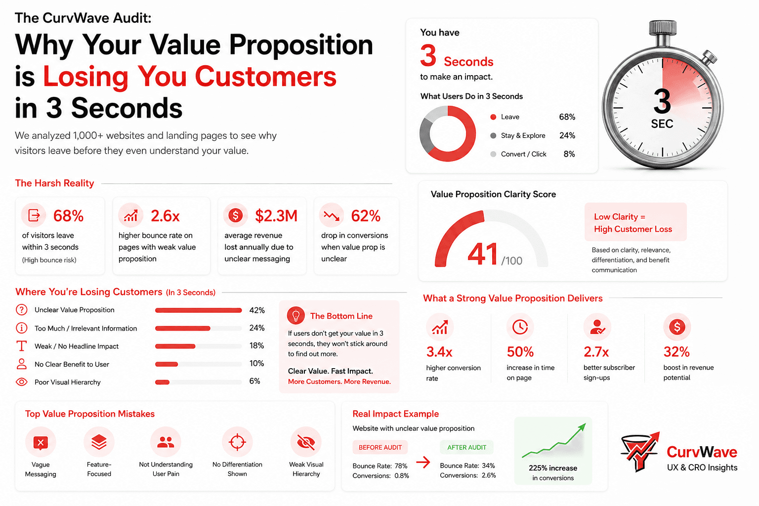
When we initiate a CurvWave UX Audit for a growing D2C brand, we test the "3-Second Rule" immediately. We show the homepage to a fresh set of eyes and ask: What does this brand sell, and why should I care? Shockingly, over 60% of websites fail this basic test because their hero section is filled with vague, artsy branding instead of a sharp, clear value proposition.
Founders often fall in love with clever copywriting, forgetting that clarity always beats cleverness. If a shopper has to scroll down or solve a riddle to understand your core offering, they will simply close the tab and buy from a competitor.
1. The "Vague Aesthetic" Trap
Phrases like "Elevate Your Lifestyle" or "Redefining Modern Essentials" sound sophisticated, but they communicate nothing about utility. Human brains crave instant cognitive closure; if we don't know what a product actually is within seconds, confusion sets in.
The CurvWave Fix: Replace generic fluff with direct, outcome-driven messaging. Tell the user what it is, who it is for, and how it makes their life better right inside the main hero headline.
2. Missing the "Why Us" Distinction
If a user lands on your site and your headline could easily belong to any other brand in your niche, you have a differentiation problem. You are forcing the user to compare prices rather than value.
The CurvWave Fix: Anchor your unique selling proposition right next to your primary call-to-action. Highlight your specific differentiator—whether it's proprietary ingredients, unmatched durability, or a unique human-centric design.
3. Burying the Primary Action Behind Clutter
A cluttered hero section featuring multiple competing banners, shifting sliders, and generic secondary CTAs dilutes user focus. When everything screams for attention, nothing gets noticed.
The CurvWave Fix: Stick to one primary headline, one powerful supporting subtext, and one high-contrast CTA button per screen view. Direct the user's eye smoothly down the conversion path.
Conclusion
At CurvWave, our core philosophy remains true: Data shows you the bounce rate, but precise human psychology fixes your messaging. Clear communication is the foundation of high-performing UX and CRO.
Are visitors bouncing before they even explore your products? Let CurvWave run a comprehensive UX & CRO audit for your brand.
Join the CurvWave UX & CRO Insights newsletter
Marketing strategy is moving away from gut feelings toward data-backed engineering. What matters now is how well you can optimize for human behavior in a crowded market.
The growth operators pulling ahead are the ones building systems to identify friction, map user psychology, and automate conversion flows. At the same time, maintaining a high-converting funnel has become a massive challenge because testing variables takes time—and most brands lack the bandwidth to do it effectively.
That’s why I built CurvWave UX & CRO Insights: to help D2C founders and growth teams move from "guessing" to "engineering" their success. Every week, I share 3-4 deep-dives covering UX audits, funnel psychology, and AI-driven workflow experiments that you can implement immediately.
You can join the newsletter here
Kirtika Srivastava
Kirtika is the founder of CurvWave and the voice behind the CurvWave UX & CRO Insights newsletter. She specializes in the intersection of human psychology and AI-driven conversion engineering. With a deep focus on UX audits and CRO, she helps high-growth D2C brands identify invisible friction and transform it into measurable revenue. She is also the author of ‘UX Decoded’ and ‘Design Mastery’.