The Mobile-First Illusion: Why Your Store Looks Great on Desktop But Kills Conversions on Mobile
Home Blog D2C
By: Kirtika Srivastava Published: Jul 15, 2026
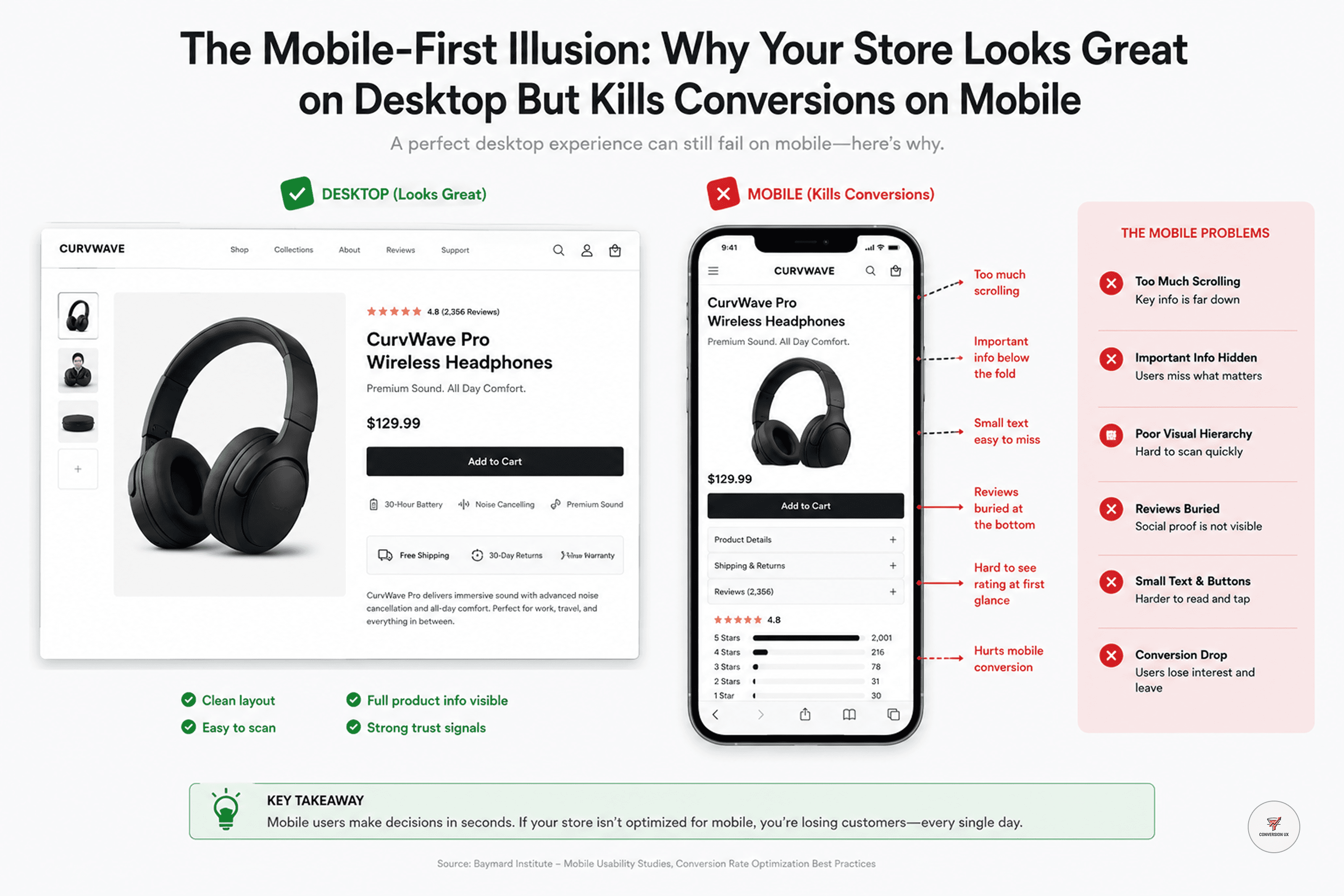
Many D2C brands make a fatal mistake: they build their website on a desktop monitor, obsess over the layout, and then assume it will "just work" on a phone. They mistake 'responsive design' for 'mobile-optimized design.' The result? A site that loads, but doesn't sell. On mobile, every millisecond of load time and every extra click is a psychological barrier that turns a motivated buyer into a "bounce."
1. The 'Thumb-Zone' Reality
Mobile is not just a smaller version of your desktop site; it’s a completely different behavioral environment. Humans use their phones with their thumbs while multitasking—they are distracted, impatient, and in a hurry. If your 'Add to Cart' button is out of the thumb’s natural reach, or if your navigation requires too much precision, you are fighting against the user’s biology. AI tools can give you the heatmap of where they click, but only a human-led UX audit understands the physical struggle of the user.
2. Performance is the New UI
On mobile, if your page doesn't load in under 2 seconds, you have already lost the battle. Google’s mobile-first indexing means your site’s speed is directly tied to your visibility. If your high-resolution images are slowing down your mobile experience, you are not just hurting your conversion rate—you are telling Google that your site isn't worth ranking.
3. Designing for the "Distracted Buyer"
Simplify the Checkout: A 5-step checkout on desktop is annoying; on mobile, it’s a death sentence. Every field that isn't strictly necessary is a chance for the user to quit.
Visual Trust: On mobile, your reviews and social proof need to be visible without the user having to scroll through three pages of text.
Thumb-Friendly Navigation: Keep your primary calls-to-action in the "thumb-friendly" bottom or center area of the screen.
Conclusion
Stop looking at your website on your laptop. Pick up your phone, go to your product page, and try to buy something. Does it feel effortless, or do you feel a hint of frustration? If it’s the latter, your marketing team is wasting money on every visitor they bring to that page. Scaling a D2C business in 2026 isn't about getting more traffic—it’s about ensuring that when a thumb lands on your site, it has a frictionless, profitable path to purchase.
Join the CurvWave UX & CRO Insights newsletter
Marketing strategy is moving away from gut feelings toward data-backed engineering. What matters now is how well you can optimize for human behavior in a crowded market.
The growth operators pulling ahead are the ones building systems to identify friction, map user psychology, and automate conversion flows. At the same time, maintaining a high-converting funnel has become a massive challenge because testing variables takes time—and most brands lack the bandwidth to do it effectively.
That’s why I built CurvWave UX & CRO Insights: to help D2C founders and growth teams move from "guessing" to "engineering" their success. Every week, I share 3-4 deep-dives covering UX audits, funnel psychology, and AI-driven workflow experiments that you can implement immediately.
You can join the newsletter here
Kirtika Srivastava
Kirtika is the founder of CurvWave and the voice behind the CurvWave UX & CRO Insights newsletter. She specializes in the intersection of human psychology and AI-driven conversion engineering. With a deep focus on UX audits and CRO, she helps high-growth D2C brands identify invisible friction and transform it into measurable revenue. She is also the author of ‘UX Decoded’ and ‘Design Mastery’.